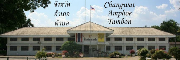
Inspired by a Tweet from another Andy, I had a look at the traffic signs pointing to the provinces and districts in Thailand, in order to create the artwork for a T-Shirt featuring the soon to be created province Bueng Kan. At first look, the artwork necessary would be almost trivial - a green slightly rounded rectangle, a white arrow and the province name in both Thai and the English transcription. But this last part is where it gets tricky - it turns out that the Department of Highways (กรมทางหลวง) uses a special font, with filled character heads and rather thick lines.
I even found a very interesting paper on the Dynamic Legibility of Standard Thai Fonts on Traffic Highway Sign, from which I learned that within Bangkok a different font is used by the Bangkok Metropolitan Authority (BMA). Now while for the English characters it was relatively easy to find a fitting font - the Mittelschrift font from the German standard DIN 1451, which as TTFs in several variants was provided by roadgeek. However the Thai font was more tricky, only thanks to the Thai Wikipedian who created several vector images of other road signs for Wikipedia I learned about the ThangLuang font. You can compare the drawing above with the example signs at the Department of Highways.
So now I don't need to reuse the district map for Bueng Kan in every posting, but have an alternative one to illustrate the text. And Andy might have his geeky shirt soon as well, and for anybody else who'd love to have the above picture on a shirt I have created a shop at Skreened. Though designing isn't my strongest skill, and I don't expect to get rich with that shop, I might add other designs for fans of this blog later...


No comments:
Post a Comment